SEA PORTLAND
Brief: The Portland Schooner Co. was in need of a brand refresher. Main deliverable to client was a brochure that can be used for future sailing seasons to come. The concept needed to convey authenticity of not only being located in Portland, Maine, but also having all historic vessels hand crafted in the state as well. The concept also needed to convey a sense of experience that customers can't capture with other local competitors. The overall immediate objective, while maintaining these key aspects, is to execute an aesthetic that is fresh and modern. Client emphasized a light look / feel.
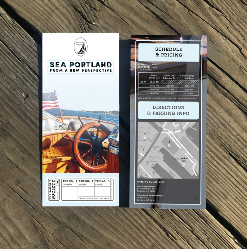
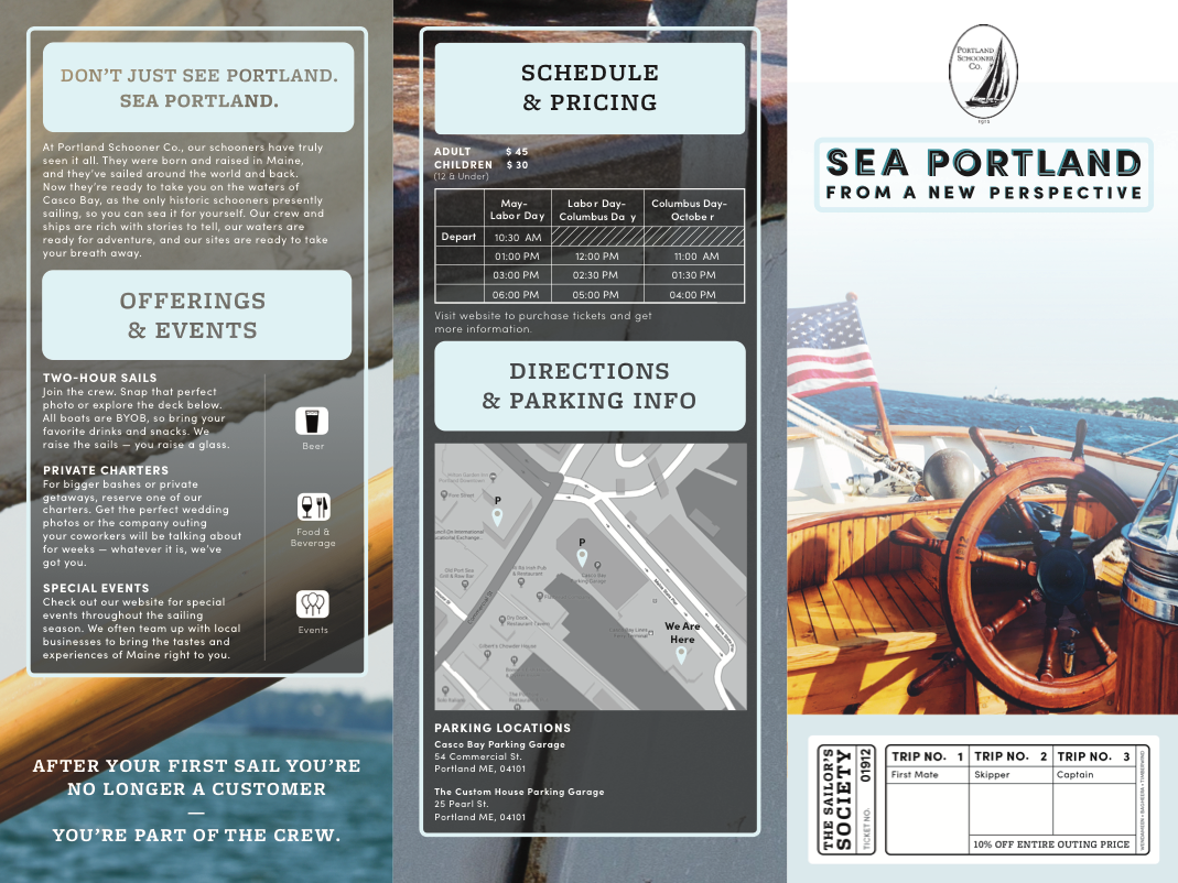
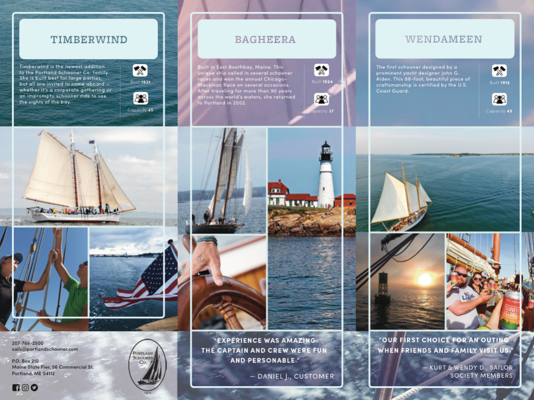
The art direction for Sea Portland focuses on the authenticity inside the experience customers receive when they sail on the Portland Schooners. This concept is maintained by imagery that shows perspective from the Schooners themselves, the customers, and the crew. The brochure is designed to show the audience exactly what they will see when sailing. Testimonials indicated that the PSC crew members are very personable, and invite engagement and involvment; creating further inspiration behind the idea. Each vessel is dedicated to it's own brochure panel. Imagery on these panels were chosen by a formulaic construct: Photography of the specific schooner, the sight you will see, and an interaction.
Caroline Crasnick, Copywriting Intern, crafted copy that conceptually spoke to the crew members hospitality. The copy is intended to be read like a conversation you would have with the crew members.
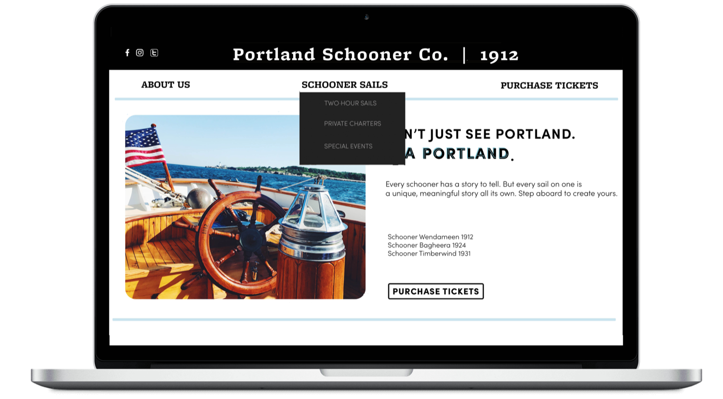
In comparison to The PSC's old brochure, the amount of copy is condensed; taking out overlap of information on the brochure that can be found on the website. We decided to use the brochure as a place for customers to receive the most necessary information about the boats, booking, pricing and scheduling. The brochure directs customers to the website for additional information. Creating an icon system for the basic information about the boats and events helped condense repetitive copy. Icon systems are an efficient way to increase the amount of information the average customer will absorb. We live in a time where attention spans are short and there is a need for information to be grasped quickly.
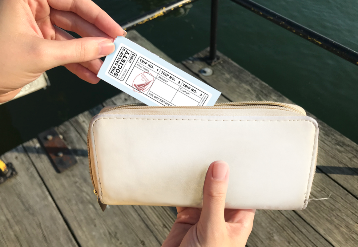
The Sailor's Society is a "frequent flyer" discount concept. This is a perforated tear-off ticket that is found on the bottom front panel. After the customer's first sail, they qualify for discounts off the entire outing price. This is an incentive for people to come back and sail with The PSC again. There are three trips available to be stamped on the tear-off inspired by the three boats within the company. After each trip is stamped, the customer graduates in rank; starting as a "First Mate", then moving up to a "Skipper", and finally a "Captain". This idea was inspired by customers feeling more like crew members than average customers. After the ticket is torn off, a quote from the manifesto is revealed; "After your first sail you're no longer a customer, you're part of the crew."
This creates a game-centric addition to the company. This tear-off also doubles as their business card on the back, still being able to fit comfortably in a wallet. The look and feel of this ticket also can be seen as a memorabilia for people to hold on to.
Shelby Burns, Copywrite Intern, collaborated with Crasnick on copy for the website. Burns also worked to redesign and promote a website that increased in efficiency and simplicity UX. Burns and I collaborated on creating a cohesive design for the website that felt married to the brochure.