Brief: A campaign position that conveys simplicity, certainty, and ease when interacting with Unum. There are a total of three campaign directions initially presented to the client.
IDEA 1
WE'VE GOT U
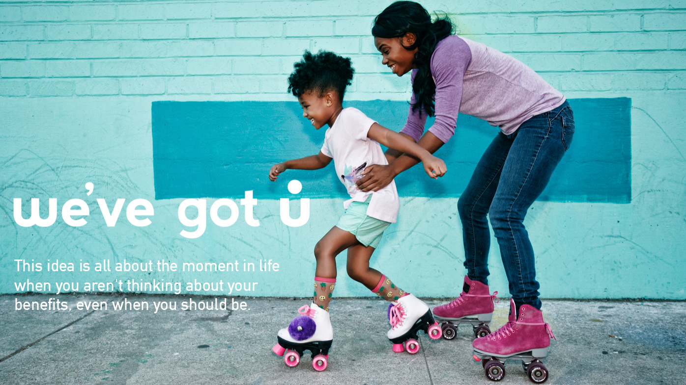
Imagery from this concept is meant to portray the moments in life when your benefits are not on your mind. Perspective fluctuates between clients and HR.
A simple build of copy is repeated among each execution that shows moments that matter the most front and center.
While empathy is delivered through employee-centric imagery and copy, this idea places Unum as a trusted expert for hassle-free benefits - all while instilling an experience that is confident and well deserved.
Rip video showing perspective-centric moments in life when you aren't thinking about your benefits, and thats the way it should be.
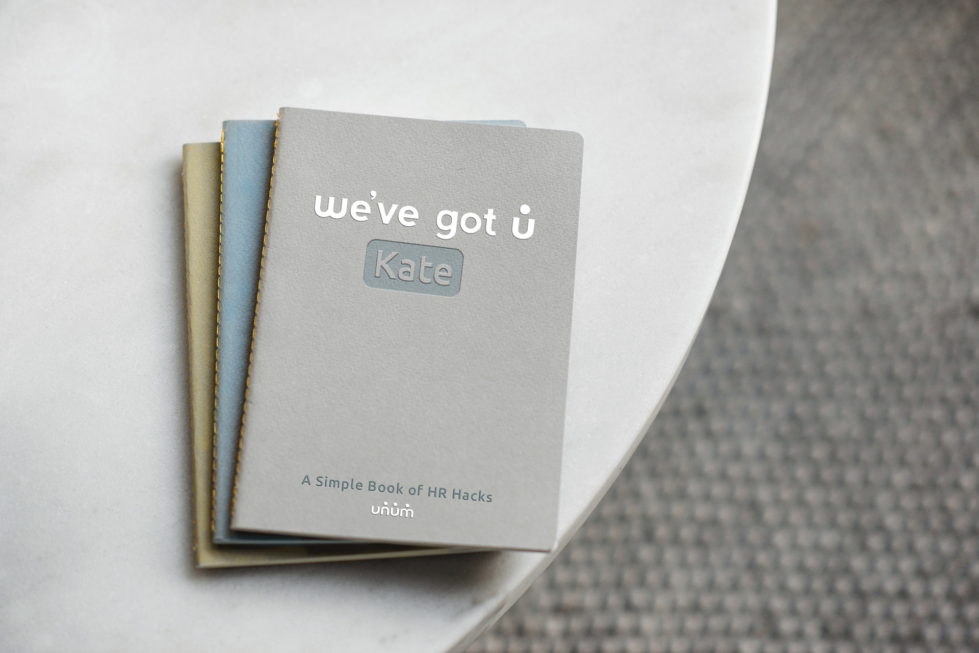
A deliverable comp presented to the client. Deliverable is showcased towards Unum’s HR. A custom book to help organize information, and offer life & office hacks.
A moving web banner comp presented to client. Speaking to viewers about the moments in life when they aren’t thinking about their benefits. And thats exactly how it should be.
IDEA 2
STORY OF U
This idea calls out the plot twists in life, and how Unum will always be here help keep your story going.
Language and tone of the brand will be plot driven and to the point, allowing the visuals to tell the story seamlessly.
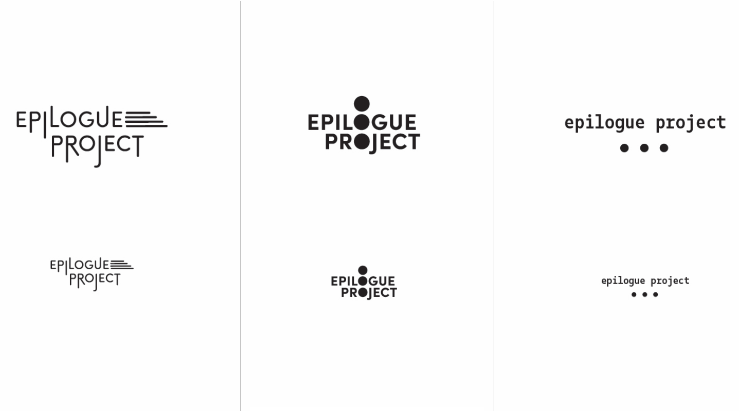
The Epilogue Project helps keep the stories alive of terminally-ill patients in the hearts and minds of close friends and family. Designed is a logotype for the project. Here are the initial sketches of the logotype.

Final logotype of The Epilogue Project presented to the client.
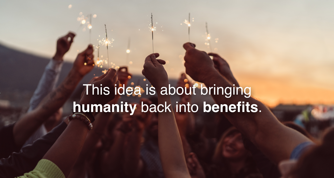
IDEA 3
UMANITY

A deliverable comp presented to the client. Deliverable showcases benefits being more human; “U” days are days off that make personal days like your birthday a holiday.