Welcome to my thesis. This is my first time blogging so please bare with me, as I will try not to bore. I aim to update this blog roughly 1-2 times a week. If all the talk about tedious typography and concepting starts to drive you nuts, feel free to jump ship at any time (I won't be offended). But to the rest of you who do stick around, I do hope you enjoy reading about my struggles and successes for the next 3 months. So without further ado...
Jan. 22
Let Us Begin
I've been thinking about what my thesis could be since my freshman year of college. But everything was much different then, including the school I attended and my major. Before I turned into a graphic design nerd, I've always imagined my thesis to be somewhere in the realm of consumerism. It's always been an interesting topic for me; the way people are attracted to things and why. It all stems directly from the way visual systems, languages, and user-experience is designed, and so on...
Why are people so attracted to these "things" we consume? Is it the beauty of the design? How easily accessible it is? What makes it easy to access? Are there different design aesthetics that resonate with some people more than others? How does a designer visually speak with semiotics and/or some of the challenges that coincide? How does a designer attract to the right type of audience? How does a designer speak to the maximum amount of people? What stylized choices will make the audience respond best?
My thesis will revolve around exploring these questions. I will be using branding to tell a story, and reveal history about a company. In a nutshell that is just what branding and identity design is; being able to convey the clients story, mission, and history. I will be showing how that is done mostly through the typography within the brand.
People commonly overlook typography and how important it really is. It is something that we interact with almost every second of the day: through texting / typing, reading screens, books, magazines, road signs, menus, and way-finding systems. Needless to say typography is almost impossible to escape from. Why are certain typefaces created? They all have a specific purpose; Some faces are designed to make it easier to read periodicals, and others for coding purposes. There is always a reason for every typeface. Some people have no idea that type designing is actually a job. Yes! There are in fact designers who sit in front of computer screens pushing nodes around to get the most precise letter forms. You know a good type designer is doing their job well when you interact with a typeface and don't even think about the letters in front of you. If your relationship between typing and reading is a seamless interaction without hiccups, and spacing is consistent, then its a job well done.
As a designer I am specifically interested in focusing on the history of typography and where it has come from. Typography stems all the way back to hand crafted letterforms, and different tools that were used to make different marks. This is where I plan on telling a story as I brand a visual identity through hand lettered forms that I craft by hand.
The identity of a liquor distillery is the "vehicle" that I will use to brand a story and history of. I am intrigued by the current design trends that beer, wine, and liquor companies carry in their identities. I will be mixing older hand lettered aesthetics with the modern trends to show the history of this industry and how it can transcend with today. Most aspects will be hand lettering. Some of these aspects include; hand-lettered logo and collateral of the craft distillery, along with extensive package designs. This distillery will offer 2-3 types of liquor: rum, tequila, and possibly whiskey (depending on how fast time moves this semester). Ideally I would like to show 3 different packaging systems under one distillery, I may only have time for 2. I will be hand lettering the word marks for each type of liquor and collateral that coincide with it.
Jan. 25
Alchemy Is Cool
I have started my research! It's exciting for sure. I was only able to dedicate a few hours of my night to note taking, but I have found some very interesting info about the history behind distillation.


Jan. 30
What If...
In Senior Independent Projects we have started out the semester creating a poster titled "What If". The poster is aimed to introduce our thesis without giving away too much; it is just a little taste to get our viewers interested.
I purposefully want the subject matter vague; keeping the content of my poster solely based on branding in general, and not so much about alcohol. The poster consists of old retail tags. I completely hand lettered text in the tags that say "What If branding could tell a story". The script is a humanist cursive. In class we critted our posters. I received extremely helpful feedback as I have already hit a wall. Since the tags in my poster come off as strictly branding retail, I will add objects like coasters, bottle caps or corks to raise some questions.
Feb. 2
Onward And Upward
Thinking about my crit last class and the helpful feedback. This is the final outcome for my "What If" poster. I photographed a coaster and used tags and bottle caps to house the hand lettered text. This up coming week will really catapult me into my thesis as it will be the first portion of my project that I will start to work on. I think I will wrap up my research on the history of distilleries and start to think about the brand I want to build.


Feb. 5
The Mirror Maze
Last week I began my research. Although I will be researching this whole semester, I think I have gathered enough information on distillery history and methods to begin my overall brand. This is nerve wracking for sure, but also exciting. I think most of my peers don't know exactly how to dive right in. Just the word itself sounds so daunting. It's like this big scary thing we are all a little afraid to touch, or get too close to. Every time someone says the word thesis we all grow a little bit more on edge. Its like one of those mirror maze houses at the circus that you went to as a kid. You're 8 year old self stands right in front of the seemingly gargantuan house. There are at least 10 different entrances to the maze, and there are millions of kids running in and out of the house trying to find the best entrance. This is how it feels right now as I approach the semester. The towering house is my thesis, and the millions of screaming terrified kids are my classmates. However I think I have found my entering point into the crazy maze, I am excited and determined. Also a little anxious for the first mirror I smack my head into.
I have arrived at lots of information about distilleries, and there is so much more out there to research. But the semester doesn't look like its going to slow down anytime soon so I will begin by coming up with a brand, the history, and the visual language this week. My goal is to have a large portion of this done by next Friday. I have began researching local distilleries to get a glimpse of how other companies brand themselves. I also have set up a meeting with Murphy Empire, who has worked with New England Distillery.


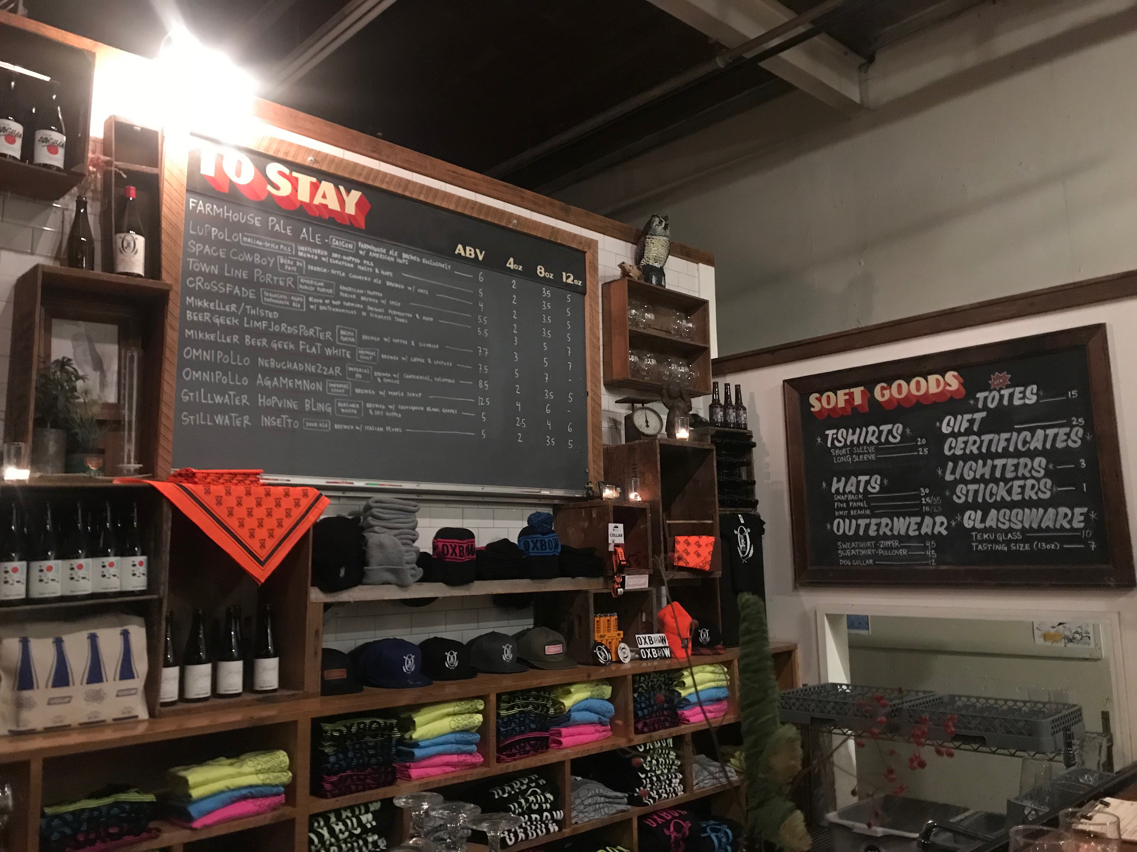
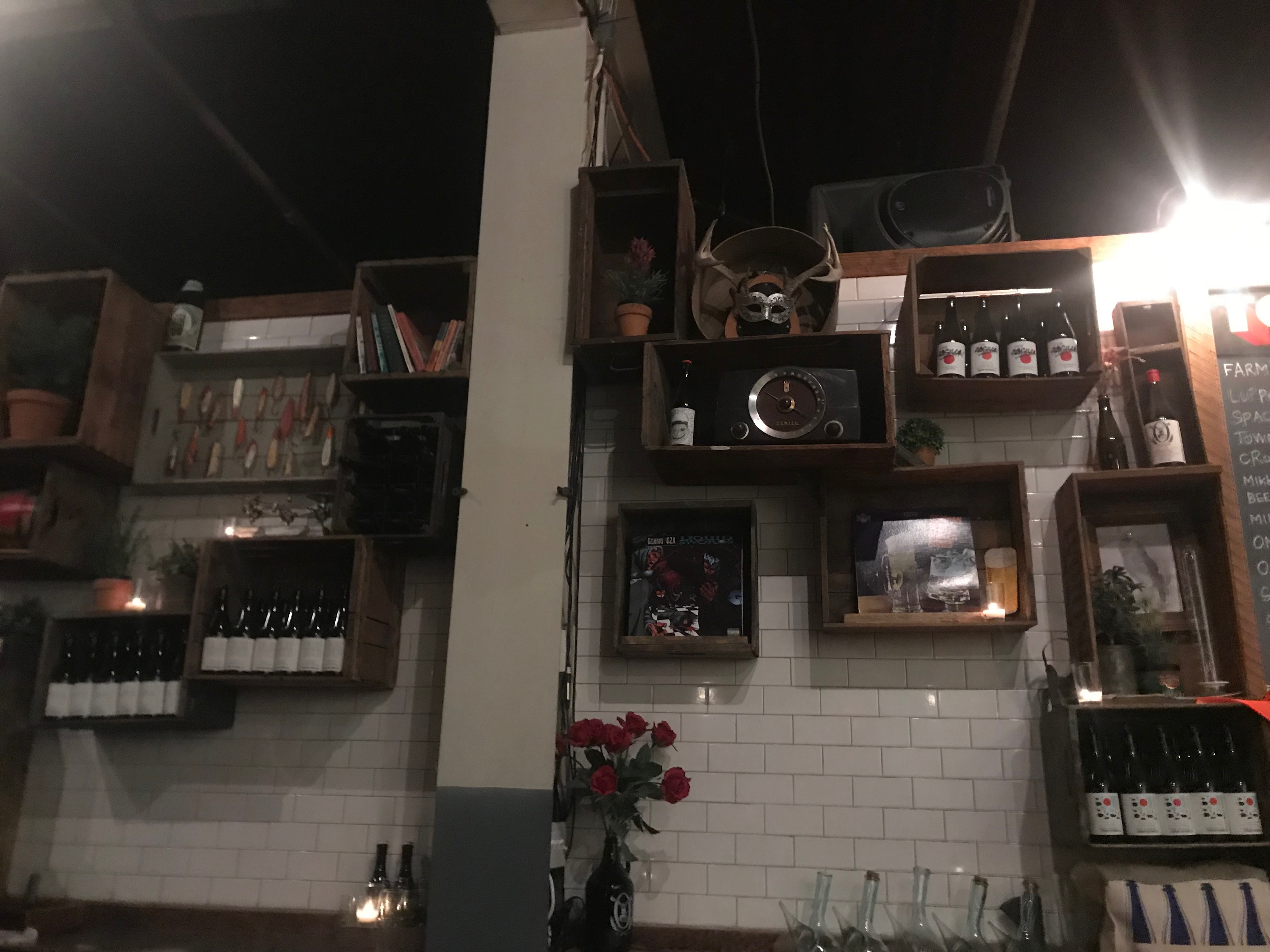
The other night I was at Oxbow Brewery for an event, and I really loved their atmosphere. It made me start to think about how I might want to install my thesis at the end of the semester. I see myself leaning towards setting up a fake bar scene, as if you were sitting at a craft distiller's bar. I know it's a little early to think about, but I want to prepare myself.. So I snapped a few pictures of their bar for reference.
Feb. 8
Ah-ha moment #1
This morning at 1:30am I had this awesome idea, or I seem to think it is.
I was thinking about my brand and who my audience is. I would like to appeal to both millennials and the older generation. And I think that is very doable. I feel this is possible by hitting on what each generation wants to see in a distilling company and offering that. Generation-X cares about the rich history behind what they are consuming. (This is a very obvious common theme among liquor companies across the board.) Millennial care a lot about craft breweries, wineries, and distilleries. Especially if you live in a place like Portland, almost everyone you meet is a "connoisseur". Good quality ingredients is important to my generation right now; we are interested in the products that are non-gmo, all organic and / or natural. Ingredients definitely matter. Millennials love craft breweries and distilleries because it is a unique place to socialize / network with lots of options for drinks. Plus it's interesting to see the process of it being made. (I promise I'll get to my ah-ha moment soon.) Since ingredients are so important and so is the history (when, where, why), I thought of a concept that would mix these two together. A distillery that gets their ingredients imported from the liquor capitals of the world. For an example: Vodka is most obviously linked to Russia; first distilled back in the 1400's. This distillery could import from Russia ingredients like potatoes, and rye used for the vodka.... another example would be importing blue agave juice from Mexico for tequila. The idea behind this is that the liquor is so close to the countries it originated from that it's the next closest thing to actually being there. A-so-close-you-can-almost-taste-it kind of thing. The branding could go in a traveller / adventurer direction. The distillery could be branded as if each liquor is a momento from each country. This would also go hand in hand with the history of the hand lettered forms I will make for all of the word marks on the bottles and the logo for the overall company.
I did more research on successful liquor brands and distilleries on a world-wide scale. I also researched distilleries around the area as well. Next week I would like to plan on visiting a few such as New England Distilling, Maine Craft Distilling, and Liquid Riot. Tomorrow I will be meeting with my summer internship employer, Murphy Empire to ask questions about the experience branding a distillery.
Today I did a massive word map that has 9 tiers. I started with words that are associated with people who are travelers, or people who journey. From there I kept branching off of words until I filled two whole pages with nothing but lines and words that may look random.

Feb. 12
The Finalists
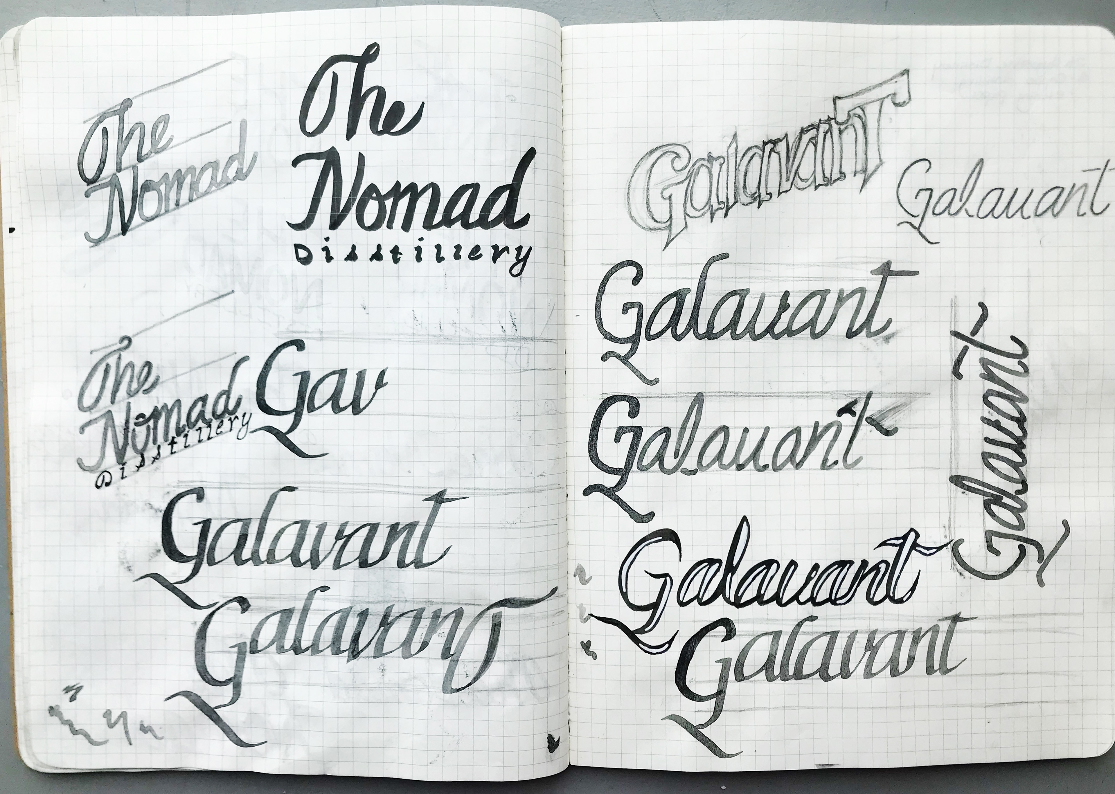
After spending lots of hours researching and trying to find a way into this crazy mirror maze, I began making my initial logo. Very rough sketches. I'm experimenting with different tools and names for the company. Right now the names are narrowed down to:
Expeditioner's
Outlander
Nomad / The Nomad's Distillery
Galavant / Galavanter
Charlatan Craft
Wayfarer
Feb. 14
Galavanting To My Grandmother
Narrowed down list of names:
Expeditioner's
Outlander
The Nomad Distillery
Galavant
I've started some sketches that play with the letter forms, and I'm starting to think about how some will look in a lock up. Now that I am starting to sketch, my favorites are "The Nomad Distillery" and "Galavant". My grandfather used to run the agency liquor store in Portsmouth, New Hampshire years and years ago. Over the weekend I went to my grandmother's house, and she was able to give me some older bottles that have been laying around her house...

Feb. 17
Spirit Searching
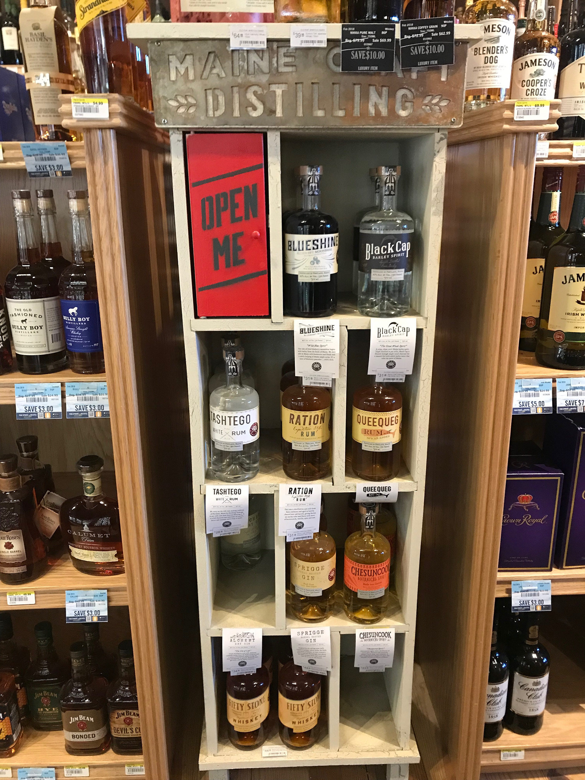
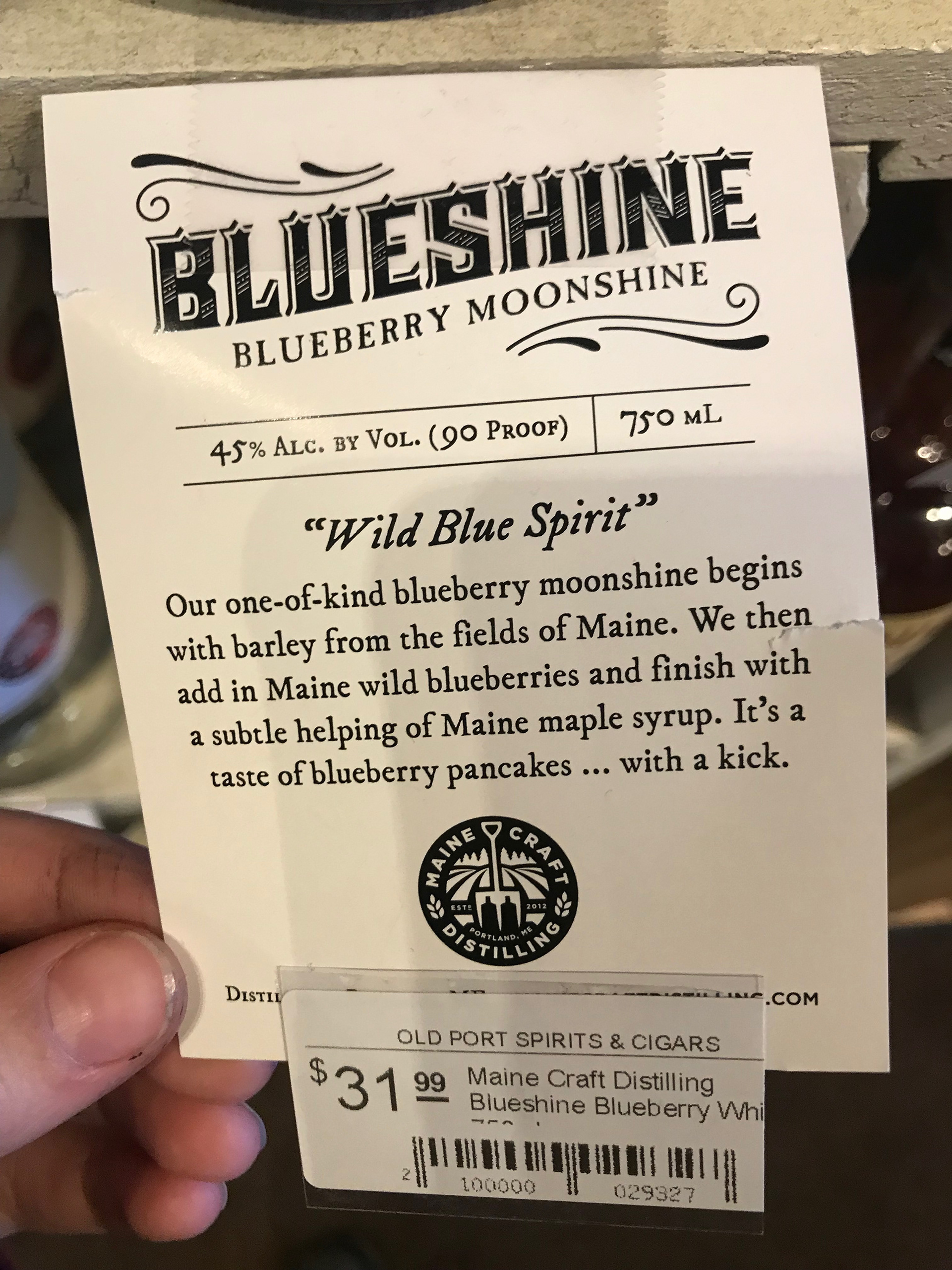
Today I went on a little expedition of my own through the old port looking for inspiration in liquor stores. And last night I checked out the liquor aisle in Whole Foods (They always have an awesome supply beautifully designed bottles), and Trader Joe's. I found a pretty unique display for Maine Craft Distillery's spirits in Whole Foods and Old Port Spirits & Cigars. It looked like a mini wooden bookcase with square shelves that housed the different types of spirits they offered. One of the shelves had a door you could open, and inside they offered a two types of "take-aways". One of the little booklets revealed their distilling process and the ingredients. The other booklet had mixology recipes. I found it very helpful to see how other companies solve certain packaging problems and how they stand out from each other on the shelve. When looking at bottles, I have been paying attention to how the logo is locked up, different logo solutions, the typographic treatments, different materials being used, bottle shapes, company concepts, and any other packaging methods.
I also started to digitize some of my word marks today... Will show progress in a few days...


Feb. 19
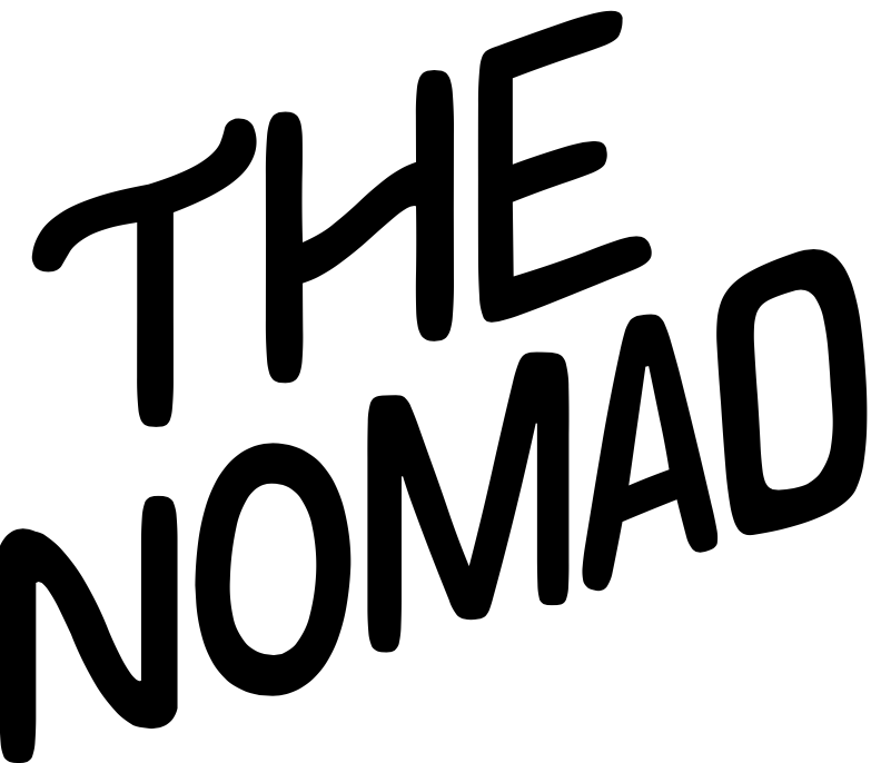
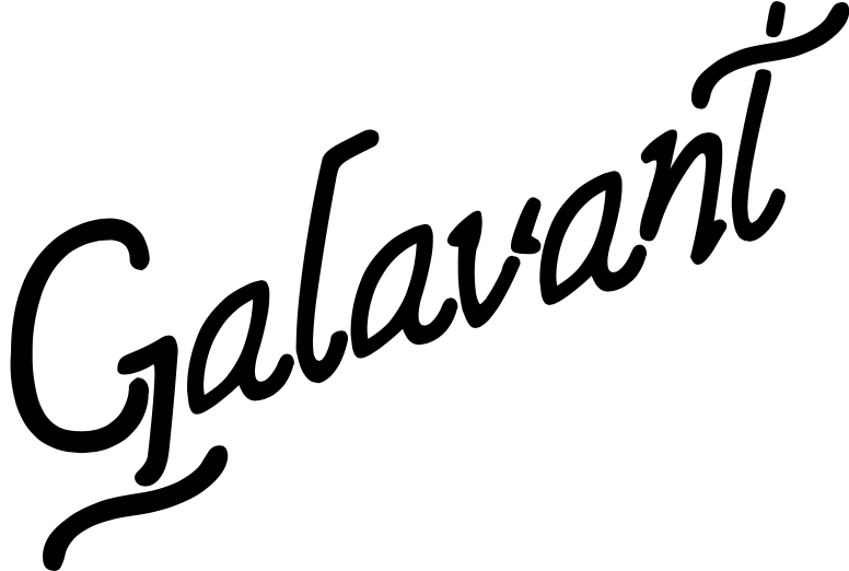
It's Time To Make a Decision
I have a digital sketch of two word marks, I have decided on going with "Galavant" as my distillery name. But here is an image of "The Nomad" word mark as well.
I also contacted Allagash Brewery today, inquiring about any barrel kegs they would be willing to part with. I explained that I am in search of one for my thesis, and that I would like to make a fake bar table out of it. They were more than willing to donate one to me! I will be going to their warehouse on Thursday to take pictures and measurements before I can pick it up... I really need to find someone with a truck or suv that could help me transport this in the near future.
Feb. 20
Makin' Plans With Some Hot Wax And Gold Foil
Today I pushed Galavant into round 2. I made a few stylistic changes that play off of the technical lettering styles. The G changed the most between now and yesterday. The descender swash is realistically suppose to lay almost horizontal, with a slight tilt to the right. I chose to change the direction and angle so it pointed in the same direction that the word was going in. The gaps in the descender were to be a little too distracting, and started to read like separate letters. I modified those breaking points to now only one. The bowl of the g has also been brought down and made to be a little wider, which in turn was also able to the letter more of the slant it should have.. also grounding it a little better. In the last round for Galavant the v, n, and t seemed to be standing a little too upright in comparison to the other letters. I also added "distilling". I know that my logo and lock up is not complete yet. But I feel like I am starting to get a little stuck with what to do now, and I have absolutely no time for that. I think the best thing to do is start finding places for my logo to live. I will add to / change the logo as I continue and see fit.
I'm also brainstorming different ways to explore labeling and packaging obstacles. Last night I placed an order for black sealing wax. I think it would be interesting to either pour hot wax over one of the spirit bottles cap and neck, or stamp the "G" from Galavant into every spirit. I bought gold foil and adhesive to rub into the labels I make! Super excited, I've always wanted to use gold foil.. The Art Mart sells silver and rose gold foil as well.. it might be good to use a different foil for each spirit..

Feb. 22
Making A Visit
Today I went to Allagash and got photos and exact measurements of the barrel. I need to approve this and make sure the barrel will adhere to the fire code in place at MECA.


Feb. 23
Rum
Now its time to think about the individual spirit packaging. Right now I'm focusing on Rum. Because it originated in the Barbados, that is where the ingredients will be theoretically imported from. From the research I have gathered, the Barbados can be known for its architecture; Jacobean, Victorian. I am wondering if that could be a possible design solution. Currently I am thinking maybe shape the label like one of their most well known buildings; the parliament building. I also need to come up with a name for Galavant's Rum.

Feb. 24
The Charles Stamp Of Approval
Quick update! After showing sketches, photos, and measurements, Charles approved my idea about incorporating a barrel keg into my installation! Very excited!!! This what I envision.... I'll either make a bar table out of it or I will keep the keg as is and treat the installation more like a trade show set up. Which may excite me more the more I think about that.

Feb. 25
180 Kinda
So I think I have a stronger concept. Although the architecture in the Barbados is beautiful, and can be well known. I feel like it does not totally hit my mark fully since the main concept for my brand is ultimately about locations. When the consumer looks at this bottle of rum, they need to understand immediately where the bottle will take you.. and that type of architecture could be in many places. After more research I feel that the Barbados, being part of the Caribbean, also has a strong relationship with botanics. This is a concept that could make more sense since. It directly relates to ingredients used in rum. I'm thinking the label includes mostly plants and flowers that grow in the Barbados, with a few native animals. I also arrived at a name that could coincide with that; Ohai Ai'i. It is their country flower, and the name means Royal.


Feb. 27
Thanks Allagash!
Today I finally went to Allagash to pick up that barrel!! So excited! It just barely fit in my friend's hatchback. I'll be honest, I was sweating it out a little.. But I have it and its beautiful!

Mar. 1
Making
In preparation for studio visits, I started mocking up shot glasses to show the beginnings for where the logo could live. As the labels start to take shape, mocking up bottles will be the next piece to the puzzle soon this week. I plan on using a laser cutter to etch the logo into the side of the shot glass.. It may only be able to etch the large G...


Mar. 4
Pieces to the Puzzle
I have started to mock up a very rough front and back label for the 750ML and the 200ML bottles. The information on the bottles are basically blocked in to get the idea moving.


In preparation for studio visits I have also printed out mood boards, original sketches, and iterations of my word marks for both the logo and the rum label for the critics to look at.


Mar. 6
To-Do's
Studio visits were today, and they went great! I received a ton of awesome feedback. Heres a glimpse of what my to-do list looks like:
750ML: Make logo larger on front label, play with background color coming off as "too blackish"? Make text on front label larger. Incorporate the flower, make barcode larger and possible incorporate the logo into it. Text on back label smaller, include website? Add flower and die cut to match the front label
200ML: Make both labels cohesive and match to scale.
Make rum labels for nip, corrections to the master logo, play with translucent language on inside of glasses, start making posters, begin to make mixology book, field guide pamphlets, posters, mock up alcohol inside the bottles,
This is what will need to get accomplished over spring break, plus working on the next set of spirits. Tomorrow the department is leaving for New York City to view studios!! I will not be returning until the 10th. After that, I have a week off for spring break and will basically be working at the school every day.
Mar. 12
Back to Work
I am back from New York! Our studio trip was amazing, we had a great time viewing studios. Our class visited and met with Applebaum, Pentagram, SpotCo., MTWTF, Open, Cooper Hewitt, and The Museum of Natural History. Now it's spring break and I am back at the school ready to work the rest of the week. I really need this week off from classes to get things done. I need to finish revisions on my rum bottle and start on tequila, but tonight I started a cocktail recipe book for my brand. The idea is to model the cocktail book after a passport to coincide with my journey-taking concept. I would like to print stickers that would be inside the book so whenever people, make a recipe they can put a sticker on the page and it would be referring to getting a page in your passport stamped.

Mar. 15
In Need Of A Solution
I've been spending a lot of time looking at my label.. I know I have scratched the surface, but the aesthetic isn't quite there yet. I feel like it needs some more texture to add character. I have this idea about using pen and ink / wood engraved plate illustration style as an accent throughout my brand. I am currently trying to figure out a way to make this style through photoshop. The closest solution to that illustration style that I can digitally make is through bitmaping... but it still doesn't seem quite right. It looks too pixelated due to the nature of that function, there is only so much I can do about that. Tonight I have been scouring the internet trying to find a tutorial or a download that I can use to help me.
Mar. 17
Precious Time
Two days later and I am still searching for a way to create this look.. I found a photoshop Action that I was able to download called Engraver. That was super confusing. I tried to figure out how to use Actions in the last two days.. it's very weird, but it's cool. The Action function would work half way and add this exact effect I have been looking for, and then something keeps going awry; looking very dark, and adding too many lines in too many directions, if that makes sense. I've spent so much time looking it up, and asking people for help. I'm thinking it's time to figure out another solution before I waste anymore precious time.
Mar. 19
There Is Hope!
OKAY. I FINALLY HAVE A SOLUTION! I was really starting to get stressed out and upset that I couldn't figure out a way for my idea to work out.. Someone in the studio suggested I check out this book that our library owns; it's a 100% copy-write free encyclopedia chalk full of wood engraved plates, and completely reproducible!!! This book is effing massive, I'm so excited. I have been splicing these illustrations to create my own scenery for the rum bottle. I also added food coloring into my bottles so I know the correct color of the spirits that will be behind the labels.
Mar. 21
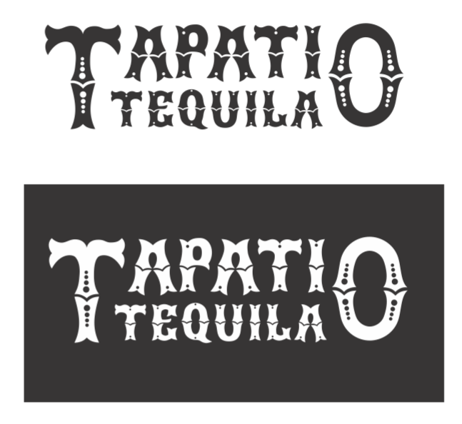
Tequila Time
I started working on the tequila today. I did research on what it would be like visiting Mexico, since that is where tequila originates from. Night life / weekend life seems to be prominent; lots of festivities are part of the culture; this includes dances / dancing for certain occasions. My research brought me to the Tapatio dance. Which is the nation's dance, resembling pride and liberty for their country. It also resembles romance / love. Mexico also has a prominent religious culture, dances are on of the ways they celebrate religion. It would be interesting to put those two pieces together. I would like to incorporate something that resembles Day of the Dead. Using that book, I am thinking about creating an image of a Mexican partner dance using two skeletons dressed in Mexican dance attire. I found an image of a partner dance, and then a separate image(s) of a skeleton, lets see how I can execute this.
Mar. 24
Tapatio Tequila
So far so good. Everything seems to be going as planned. I have also been working on sketching the word-mark for this spirit. I am starting to like the direction of this word mark more than the rum word-mark. I'd like to revisit that if I have some time.. Here is a look at my sketches so far.


Mar. 26
Progress
Over the last two days I have been working like mad on my word-mark. But I think it's at a good place for now.
Mar. 28
Portfolio Day Prep.
I am starting to somewhat finalize and make certain decisions on the labels. Tonight I was able to mock up the labels with gold paint on the edges of the labels. Things are really starting to pull together. I do still need to get the sizing down to its correct scale on the other bottle sizes. I also started to mockup other promotional products like glasses and shot glasses, establishing some visual language. Tomorrow I plan on working on more mockups so I have plenty to show on portfolio day. I really want to take this time to get feedback on my thesis from other designers in the field. Portfolio Day is on Friday, and I think I am ready to show my progress thus far.
Mar. 31
Taking Trips
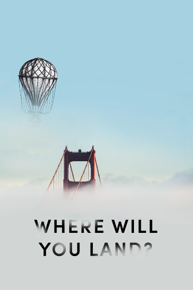
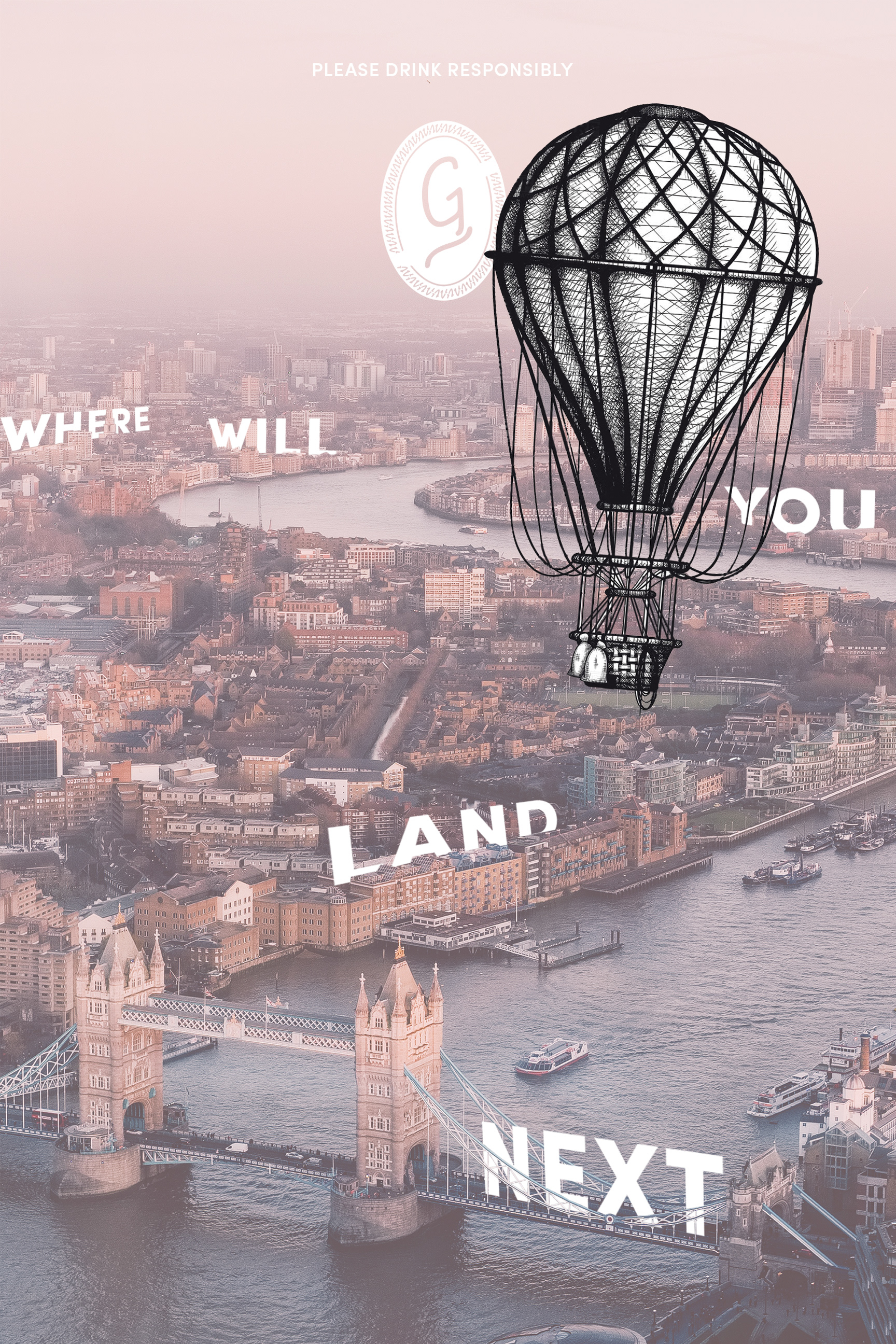
I've been focusing a lot lately on creating a set of advertisement posters for the brand. I'm thinking a set of 3 posters that deal with the transportation aspect. I feel this is important because the brand focuses on traveling from place to place with each bottle, so showing the in between and bridging that gap would be a fun concept. But I also want this sense of anonymity; A concept that says "where will you go?" "how are you getting there?". I'd like to have the posters revolving around a hot air balloon, a train, and a ship. Evoking a sense of older transportation would be something I want to deal with. I plan on using the same wood engraved illustration style since that is something I have established in the brand. I think it would be interesting to have realistic imagery of a place you would travel to, and add the juxtaposition of a wood engraved illustration being the transportation. This change in object would tell the audience "this could be you", "insert yourself here..". I would like to use language that poses a question for each poster.
Apr. 2
Hot Air Balloons
Here is the first draft of the first poster. In this one I am dealing with hot air balloons.

Apr. 5
Type And Image
I like the play in type with image on the second poster vs. the first. It seems static to have the type dead center, and what I do in one poster I want to do in all of them to show unification of the brand. I like the image in the first picture, it feels more emotional to me. I am thinking of how I can play with the typography there.
Apr. 7
Coasters!!
Side note from the posters, my coasters came in yesterday!! I'm super excited, anyone who knows me knows that I love coaster. I have a collection of almost 200 coasters. I usually like to snag interesting looking coasters from restaurants or bars. I think it's going to be cool to look back and see the design changes in objects to small that usually get thrown away, yet are still used valuably to advertise..... So of course I had to make coasters for my thesis, and of course I took two coasters for me to save for myself.

Apr. 9
Fresh Prints
The posters are finished and printed out! For the hot air balloon poster I used the type to stand with the buildings among the cityscape as it asks where you will land. For the train poster I placed the typography in sky as it weaves in and out of the clouds. For the ship poster I placed the type in the water as if it was floating. These were printed on 24x36 matte paper. I feel pleased with how they turned out as a set.


Apr. 11
Photoshoots
Today I T-shirts came in from Vistaprint! I'm really excited to see these. I set up a quick mini photoshoot. I want to get in a habit of photographing my products a step further than on a white backdrop. Starting to focus on the atmosphere is a goal. I also took photographs of my friends modeling them (obviously not edited yet.)


Apr. 13
Applying the Word Mark
Today I painted the Galavant word mark on the top of my barrel keg! I had some fun with it and took photographs as I progressed so I could make a quick process video. I also took this opportunity to take a new bio photo of myself working.


Apr. 15
Don't Forget Your Passport
Time is definitely running fast. I am now starting to finalize everything, as it is now time to make thesis books. Yesterday I finished the final cocktail passport recipe books. I printed 20 books out for people to take in the thesis show. I imagine they will be displayed next to my business cards. I still need to print and perforate stickers for the books..


